




What Makes a Good Landing Page? Checklist and Examples
What makes a good landing page: one goal, a headline that keeps the ad's promise, a clear button, proof, a short form and tracking. Checklist and examples.
The short answer
- 01
Build each page for one job. A good landing page is built for one group of visitors and one action, and drops anything that pulls them elsewhere.
- 02
Put the essentials on the first screen. On a phone, the headline, who it is for, the main button and a reason to trust you should all be visible before anyone scrolls.
- 03
Make it easy to reply, then measure it. Offer the contact option your customers prefer (in Singapore that often includes WhatsApp), keep the form short with a PDPA notice, and track every enquiry in GA4.
A good landing page has one goal and makes it easy to reach. In the first screen it tells visitors what you offer and who it is for, in the same words as the ad or link they clicked. It gives them one clear next step, backs the offer with proof close to that step, asks only for the details you need to reply, loads quickly on a phone and records every enquiry so you can see which campaigns work.
We design and build landing pages for Singapore businesses through our landing page design service. This guide covers what each part of a landing page does, what has to fit in the first screen of a phone, the Singapore details that change how you build it, a before-and-after of the same page, real examples, and the tracking you need to tell whether it works. If your traffic comes from Google Ads, our guide to landing pages for Google Ads covers Quality Score and Google’s requirements in detail.
What is a landing page, and how is it different from a homepage?
A landing page is a page built for visitors arriving from one source, such as an ad, an email or a social post, with one action you want them to take. That action might be a quote request, a booking, a WhatsApp chat, a sign-up or a download.
A homepage has a different job. It introduces the whole business to everyone, from job seekers to existing clients, so it offers many paths. A landing page offers one.
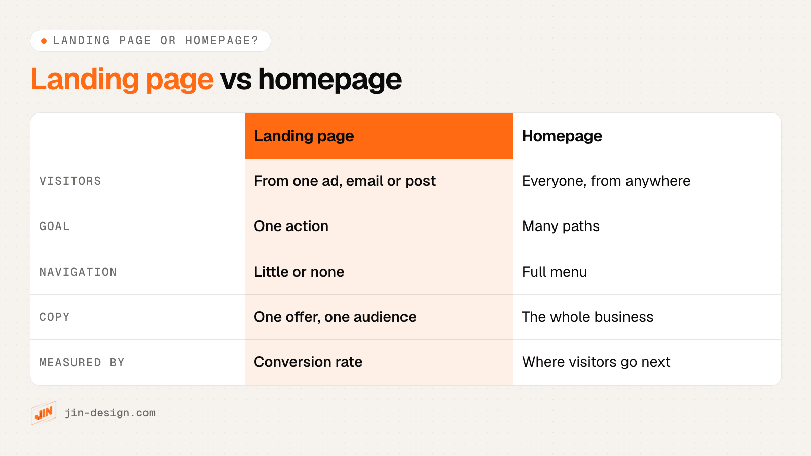
This is why sending paid traffic to a homepage tends to waste clicks. The visitor who searched for a move-out cleaning service lands among office cleaning, careers and a company history, and has to find their own way to what the ad promised.
What makes a good landing page? The parts that matter
A good landing page answers the visitor’s questions in the order they ask them: am I in the right place, is this for me, can I trust them, what exactly do I get, and how do I get in touch? The wireframe below shows those parts on one page for a fictional cleaning company.
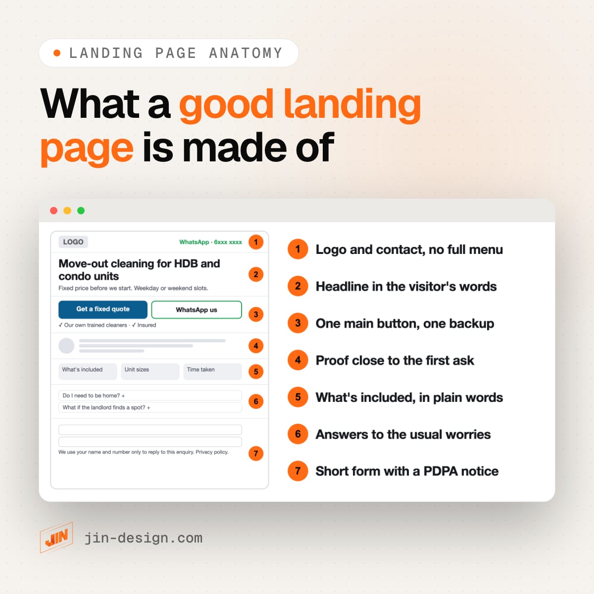
1. A top bar with your logo and contact, without the full menu
Keep the logo so visitors know whose page it is, and a phone or WhatsApp link for people who prefer to talk. Remove the main menu. Each menu item is a way to leave the page before acting. Your privacy policy, address and business details can sit in the footer.
2. A headline in the visitor’s own words
The headline should repeat what the visitor clicked on. If the ad said “move-out cleaning for HDB flats”, the headline says the same, not “Welcome to our company”. Below it, one supporting line says who it is for and what happens next: “Fixed price before we start. Weekday or weekend slots.”
Write for skimmers. Nielsen Norman Group’s research estimated that people read at most 28% of the words on an average page visit, and about 20% is more likely. The headline, the button and the bold lines carry most of the message.
3. One main button, and one backup at most
Pick the action that matters most and make it the main button, with a label that says what happens: “Get a fixed quote” rather than “Submit” or “Learn more”. A second option such as “WhatsApp us” suits people who would rather chat. More than two choices makes people stop and think, which is the opposite of what you want.
Make the button easy to tap and easy to see. WCAG 2.2, the accessibility standard most sites follow, sets a minimum target size of 24 by 24 CSS pixels and a contrast of at least 4.5 to 1 for normal text. Our free colour contrast checker tests your button and text colours against it.
4. Proof close to the first ask
Put a reason to trust you next to the button, not at the bottom of the page. That can be a short customer quote with a name, the logos of clients you have worked with, the number of years in business, or a licence or membership your industry recognises. Use only real proof you can back up, with the customer’s permission.
Some sectors have rules about proof. Licensed clinics, for example, can show patient reviews on their own website only under the conditions in the Healthcare Services (Advertisement) Regulations; our Google Ads landing page guide sets out what those rules mean for a page.
5. What is included, in plain words
Describe what the customer gets, not what your company is. For a cleaning service that means the rooms covered, the unit sizes you handle and how long it takes. For a course it means the topics, the schedule and who teaches it. Short bullet points and a few clear photos of real work do more here than general claims.
6. Answers to the usual worries
Every service has questions that stop people from acting: Do I need to be home? What if I am not happy with the result? How do I pay? Answer the common ones on the page, in a short FAQ near the end. These are the questions your team already answers on the phone every week.
7. A short form or contact button, with a PDPA notice
Ask for what you need to reply and nothing more. Each extra field is one more reason to leave. Next to the button, say what you will use the details for, as covered in the Singapore section below.
What should be above the fold on a landing page?
Above the fold means the first screen a visitor sees before scrolling. It decides whether they stay. In Nielsen Norman Group’s 2018 eyetracking study, 57% of page-viewing time was spent above the fold and 74% within the first two screenfuls. People do scroll, so the rest of the page matters, but the first screen gets the most attention.
In Singapore that first screen is often a phone. StatCounter’s figures for September 2026 put mobile at about 57% of web page views in Singapore, against about 42% for desktop. Design the phone screen first, then widen it for desktop.
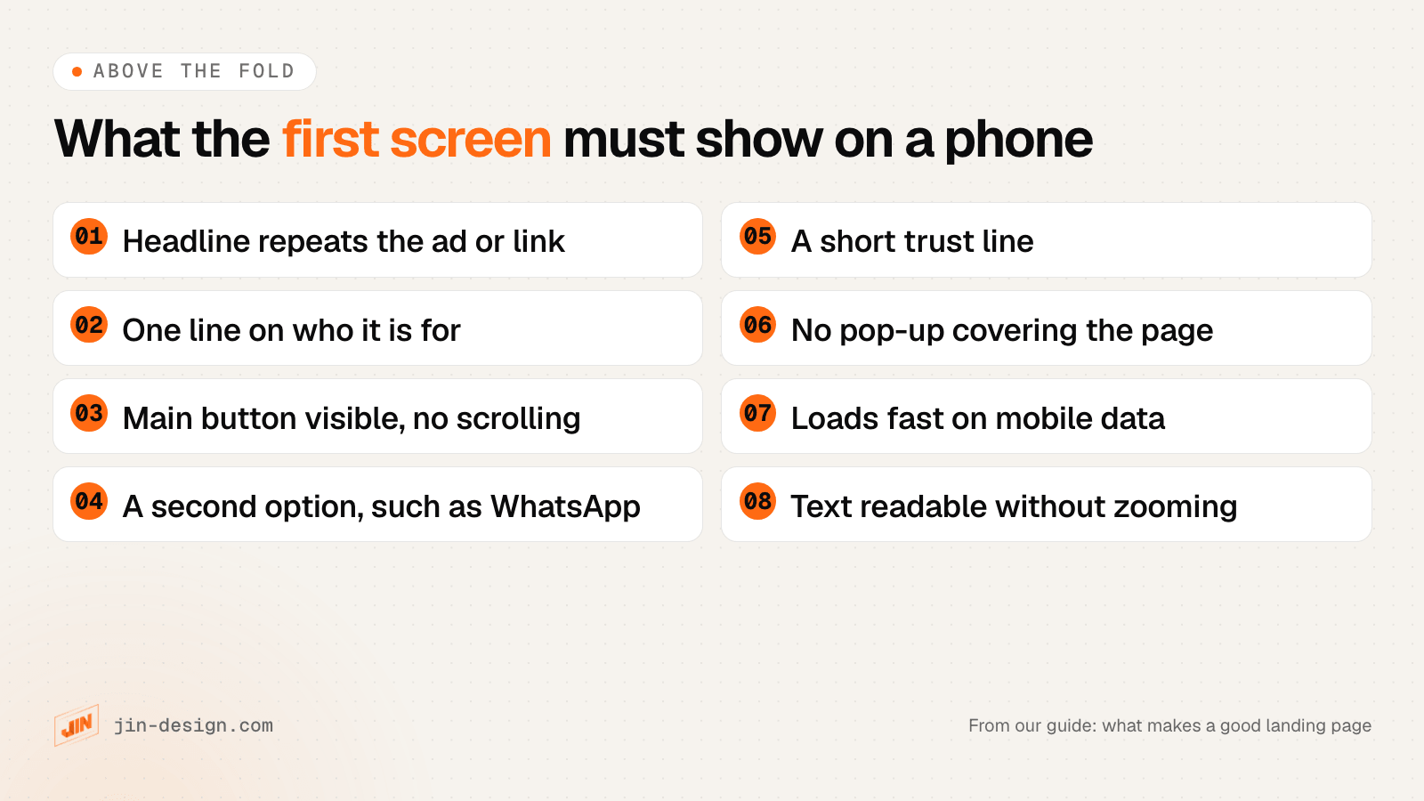
A quick way to test it: open the page on your own phone, look at it for five seconds, then look away. If you cannot say what the page offers and what you are meant to do, a visitor cannot either.
Speed belongs to the first screen too. Google’s Core Web Vitals treat a page as good when its largest content appears within 2.5 seconds, it responds to taps within 200 milliseconds and its layout shifts no more than 0.1. Large sliders, autoplay videos and chat widgets that load before the content are the usual reasons a landing page misses those numbers.
Landing page best practice for Singapore businesses
A few things work differently for Singapore businesses.
Offer WhatsApp as well as a form
WhatsApp is the most-used app in Singapore, with four in five people using it every month, according to the Digital 2026 Singapore report by We Are Social and Meltwater. Many customers would rather send a quick message, or a photo of the job, than fill in a form.
A WhatsApp button uses WhatsApp’s click to chat link: https://wa.me/65 followed by your eight-digit number, with no plus sign, spaces or dashes. Add ?text= and a short message, so the chat opens with the service already named, for example “Hi, I’d like a quote for move-out cleaning”. Show your reply hours next to the button so evening messages do not feel ignored.
Keep a form as well. A form gives you the details to quote in one go, and it is the most reliable conversion to measure, as the tracking section below explains.
Put a PDPA notice next to the form
Under the PDPA, you need to tell people why you are collecting their details and only use them for that purpose. On a landing page, one plain line next to the button covers replying to the enquiry:
We will use your name and phone number only to reply to this enquiry and arrange your service. See our privacy policy.
If you also want to send offers, add a separate, optional, unticked box for it. Silence or inaction is not consent, so a pre-ticked box does not count. Our guide to PDPA for websites covers the notice, consent and the Do Not Call rules in more detail. This is general guidance, not legal advice.
Show prices the way Singapore rules expect
If you show a price and your business is GST-registered, the price shown to customers must include GST, which is 9%. A price marked “inclusive of GST” is clearer than a lower figure with “+GST” in small print, and showing the GST-inclusive price is what IRAS requires.
Write in the language of the ad
If you run ads in Chinese or Malay as well as English, give each language its own landing page. A visitor who clicked an ad in Chinese should not land on an English page.
Landing page before and after: what changes
Here is the same fictional cleaning company, first with a typical company page used as a landing page, then with a first screen rebuilt around the ad that brought the visitor.
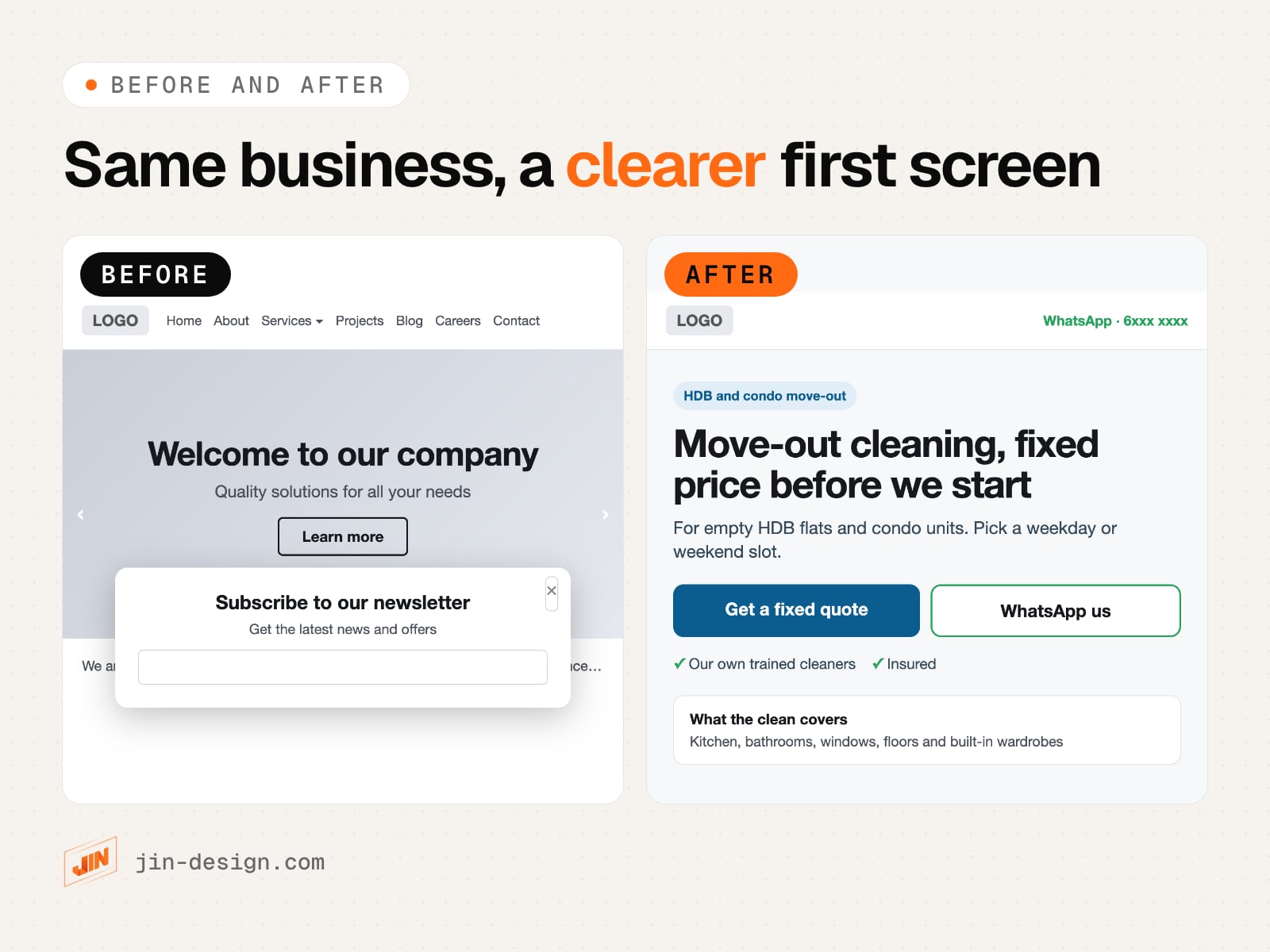
| Before | After | |
|---|---|---|
| Top of the page | Full menu with seven links | Logo and WhatsApp number only |
| Headline | “Welcome to our company” | “Move-out cleaning, fixed price before we start” |
| Supporting line | “Quality solutions for all your needs” | Who it is for and how booking works |
| Main action | “Learn more” | “Get a fixed quote”, with “WhatsApp us” as the backup |
| Trust | None on the first screen | Own trained cleaners, insured |
| Interruptions | Newsletter pop-up on arrival | None |
| What the visitor learns in five seconds | That this is a company | What it offers, for whom, and how to get a quote |
None of these changes needs a new website; they are mostly decisions about copy and layout. That is usually where we start when a client asks us to look at a page that gets clicks but few enquiries.
Real landing page examples and what they show
Two real pages show the same principles at work. We describe their structure as it appeared when we checked them on 20 October 2026; pages change often, so look at the current versions yourself.
Grab’s driver-partner page for Singapore (grab.com/sg/driver). The page opens with the headline “Be a Grab driver-partner” and one button to download the driver app. It then covers why to sign up, quotes from named driver-partners, tabs for each type of vehicle, who can apply and the steps to start, and a set of FAQs, before closing with a “Sign Up” button. It is a long page, and each section answers the next question a would-be driver has, with the action repeated at the end.
Xero’s free trial sign-up page for Singapore (xero.com/sg/signup). The headline states the offer, “Start a 30-day free trial”, followed by three short lines covering the usual worries: no credit card required, 24/7 online support and cancel anytime. The form asks for a name, email, phone number (with +65 already selected) and location, and the line above the button links to the terms of use, privacy notice and offer details. It shows how short a page can be when the offer is simple and the worries are answered in a few words.
The first is long and the second is short, yet they share the same base: one action, the offer stated in the headline, and the common objections answered before the ask.
How do you track conversions on a landing page?
If you do not count enquiries, you cannot tell which ad, email or page is working. Set this up and test it before you spend on traffic.
- Install GA4 and link it to your ad accounts. In Google Ads, keep auto-tagging on and link the account to GA4. For every other link you share, such as a Meta ad, an email or a WhatsApp broadcast, add UTM tags with our free UTM builder, so GA4 knows where each visitor came from.
- Create an event for each way to contact you. For the form, GA4’s recommended event is generate_lead, fired when the form has been sent successfully, not when the button is pressed. For WhatsApp and phone buttons, fire events such as
whatsapp_clickandphone_clickwhen someone taps awa.meortel:link. - Mark them as key events. GA4 calls the actions that matter most key events. Once GA4 is linked to Google Ads, you can import them as Google Ads conversions.
- Treat taps as softer than forms. A tap on WhatsApp or a phone number is not yet a conversation. Google forwarding numbers for call tracking are not offered in Singapore, so Google Ads can count taps on your number but not the calls themselves. Compare taps each month with the chats and calls your team actually received.
- Send a test of each one. Submit the form, tap each button, and check that the events appear in GA4 and in your ad accounts before the campaign starts.
Our Google Ads landing page guide goes further, with primary and secondary conversions, enhanced conversions and importing enquiries that became customers. If you would rather have it done for you, our website analytics and tracking service sets up and tests the events.
How do you know if a landing page is working?
Divide the number of conversions by the number of visitors to the page over the same period. A page with 1,000 visitors and 40 enquiries converts at 4%.
Benchmarks are a rough guide at best. Unbounce’s 2024 Conversion Benchmark Report, based on more than 41,000 landing pages built on its platform and over 57 million conversions, gives a median conversion rate of 6.6% across industries. Its pages, its industries and its definition of a conversion may not match yours, so the most useful comparison is your page against its own past months, and against other pages on your site that get the same kind of traffic.
When the numbers disappoint, look for where people stop before changing everything:
- Visitors leave at once. The first screen does not match what they clicked, or it loads slowly. Read the ad and the headline side by side.
- Visitors scroll but do not act. The offer is unclear, the proof is weak or the button is hard to find. Scroll maps and session recordings show where attention drops.
- Visitors start the form but do not finish. The form asks too much, or an error message blocks phone numbers in a local format. Test it on a phone.
- Many WhatsApp taps, few chats. People tap but do not send. Check that the pre-filled message works and that someone replies quickly.
Testing two versions against each other needs more visitors than most small campaigns get. Our Google Ads guide includes a worked sample-size example for a Singapore budget. With modest traffic, change one big thing at a time, such as the offer or the main contact option, and compare whole months.
Landing page checklist before you launch
Run through this list on a real phone before any money goes into traffic:
- The headline repeats the words of the ad, email or post that links to the page.
- One line under the headline says who it is for and what happens next.
- The main button is visible without scrolling and says what happens when tapped.
- There is at most one backup contact option, such as WhatsApp, and it opens a chat with a pre-filled message.
- Proof sits near the first button, and every claim on the page can be backed up.
- The full menu is gone; the footer has your privacy policy and business details.
- The form asks only for what you need, with a PDPA notice next to the button and an unticked box for marketing.
- Prices shown include GST if you are GST-registered.
- No pop-up covers the page on arrival.
- The page passes Core Web Vitals on mobile, or loads quickly on a mid-range phone on mobile data if it is too new for field data.
- Text and buttons meet WCAG contrast, and buttons are easy to tap.
- The form, WhatsApp and phone buttons each fire a GA4 event, marked as a key event, and a test of each one has been checked.
- Links from ads and posts carry the right UTM tags or Google Ads auto-tagging.
To plan the page before design starts, our free landing page brief puts the goal, the audience, the promise, the outline and the tracking plan on one document.
Need help building a landing page that converts?
We write, design and build landing pages for Singapore businesses, with form, WhatsApp and call tracking tested before the campaign starts. See what our landing page design service covers, or talk to us about your next campaign.
Frequently asked questions
What are the key elements of a good landing page?
A headline that repeats what the visitor clicked on, one line on who the offer is for, one main call to action with at most one backup, proof such as reviews or client logos placed near the ask, a plain description of what is included, answers to common worries, and a short form or contact button. Underneath, the page needs to load quickly on a phone and record every enquiry.
Should a landing page have navigation?
Usually not a full menu. Every link that leads away from the page is a way to leave without acting. Keep the logo and a contact option at the top, and link to your privacy policy and contact details in the footer. Pages that serve visitors who need to research first, such as a high-value B2B service, can link to a few supporting pages without hurting the main goal.
How long should a landing page be?
As long as the visitor needs to decide. A free download or a simple booking can be one screen. A renovation, a course or a B2B service needs more: what is included, how it works, proof and answers to common questions. Keep the main button visible at the top and repeat it after each major section, so people who are ready early can act.
What is a good conversion rate for a landing page?
There is no single good number, because it depends on the offer, the traffic and what counts as a conversion. Unbounce's 2024 Conversion Benchmark Report, based on more than 41,000 landing pages built on its platform, gives a median of 6.6% across industries. Compare your page with its own past results and with other pages on your site that get the same kind of traffic.
What is the difference between a landing page and a homepage?
A homepage introduces the whole business to every kind of visitor and offers many paths. A landing page is built for visitors from one ad, email or post, focuses on one offer and asks for one action. That is why a landing page usually has little or no navigation and is judged by its conversion rate.
Can a landing page rank on Google?
Yes, if it answers a search well and Google can index it. Pages built only for ads are often thin, set to noindex or duplicated for each campaign, so they rarely rank. A landing page meant to rank needs enough useful text for the search, a clear title and description, and links from the rest of your site.
What should a landing page form ask for in Singapore?
Only what you need to reply, usually a name, a phone number or email and one question about the job. Next to the button, say what you will use the details for, and add a separate, unticked box if you also want to send marketing messages. The PDPC's guidance generally advises against collecting NRIC numbers unless the law requires it or identity must be verified to a high degree, so a quote request should not ask for one.