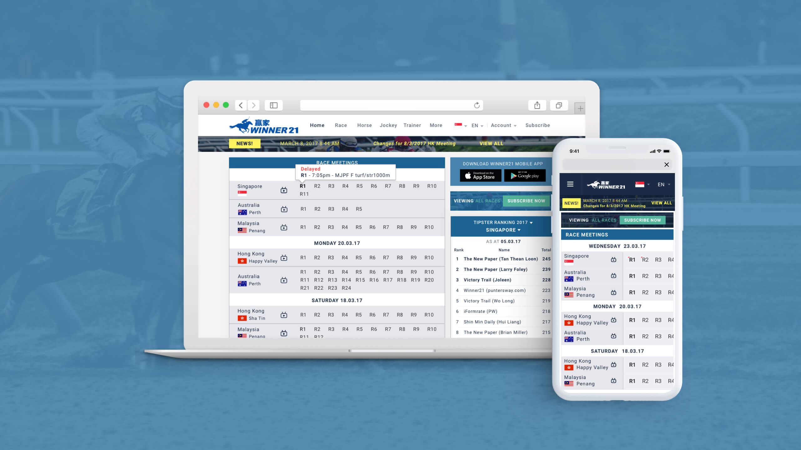


Winner21 is a website that needed to deliver information to users quickly.
Our focus for this project was to prioritise functionality over aesthetics, ensuring that data could be clearly seen and easily accessed.
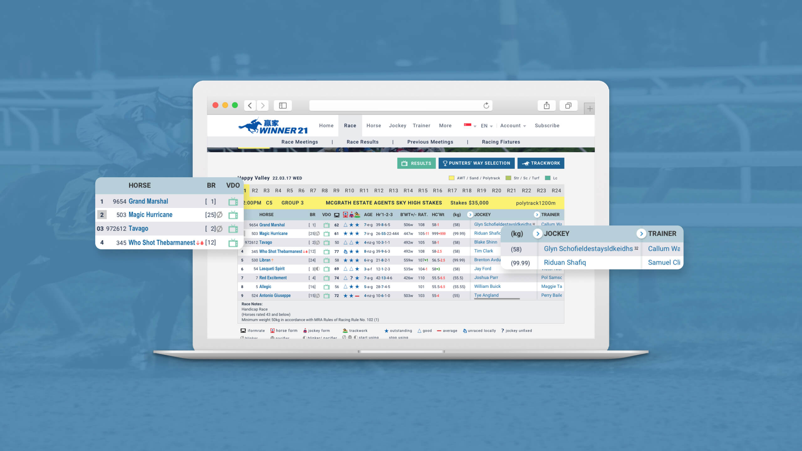
Reducing data overload into digestible chunks
The challenge was transforming numerous long tables of raw data. We needed to reduce the fatigue on the user caused by information overload.
Our research comprised the effective use of space and how to clearly communicate information. Instead of showing everything at once, we adopted a collapsible column framework.
This solution structures the content neatly while improving readability. Users can simply expand the columns when they want to see more information.
Specific information for specific audience
In our research phase, we quickly realised that the data was intended for a highly specific audience. Horse-racing enthusiasts visiting Winner21 knew exactly what each symbol stood for and we did not need to simplify it for the layman.
Instead we focused on helping our users access the information they were looking for. Through indexing via country, races or dates, they can choose different data combinations and streamline the results they wish to see.
Better text readability
The majority of our users were in the 40s – 60s age group. This meant that visual impairments would be more common amongst them and we had to maintain a good level of readability.
Colour perception may be an issue to these ‘non-traditional’ users, so we chose a simple colour scheme for a neater look.
We made the font sizes bigger to cater for that age group. We also made sure that everything was spaced out adequately to allow breathing space and prevent overcrowding.
Simplicity for greater clarity
Even though the solutions may appear to be simple. The complexity of the data and accurately presenting them was challenging. The research into understanding the online reading habits of the target users provided deep insights in designing the correct solution.