
Republic Polytechnic (RP) prides itself on building strong connections between students, facilitators, and industry.
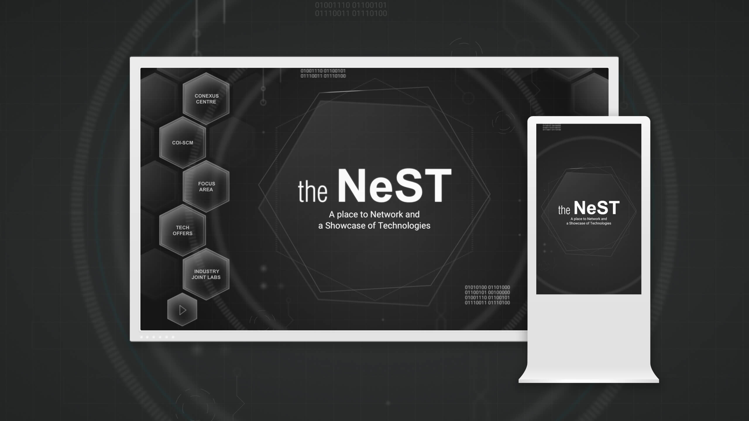
To help attract and secure collaboration with visiting SMEs, RP engaged us to design The NeST: an interactive interface showcasing RP’s technological capabilities.
Preserving branding, highlighting strengths
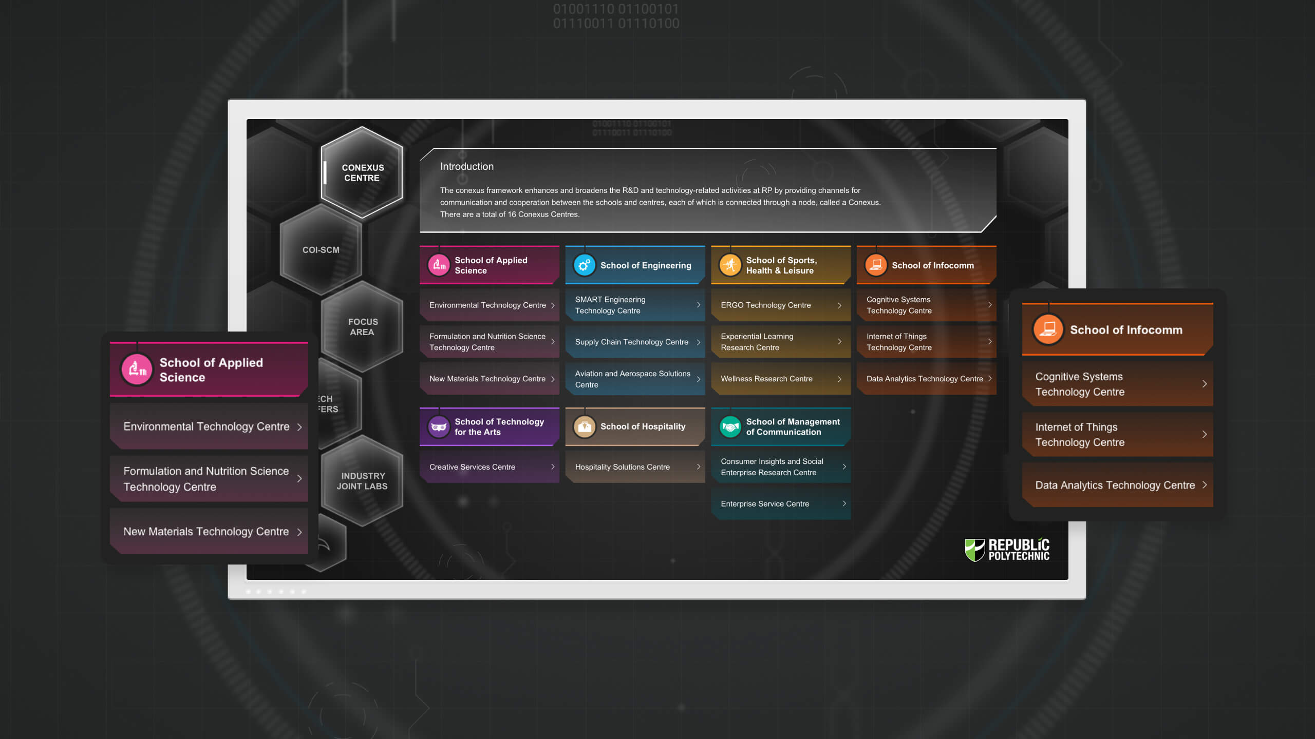
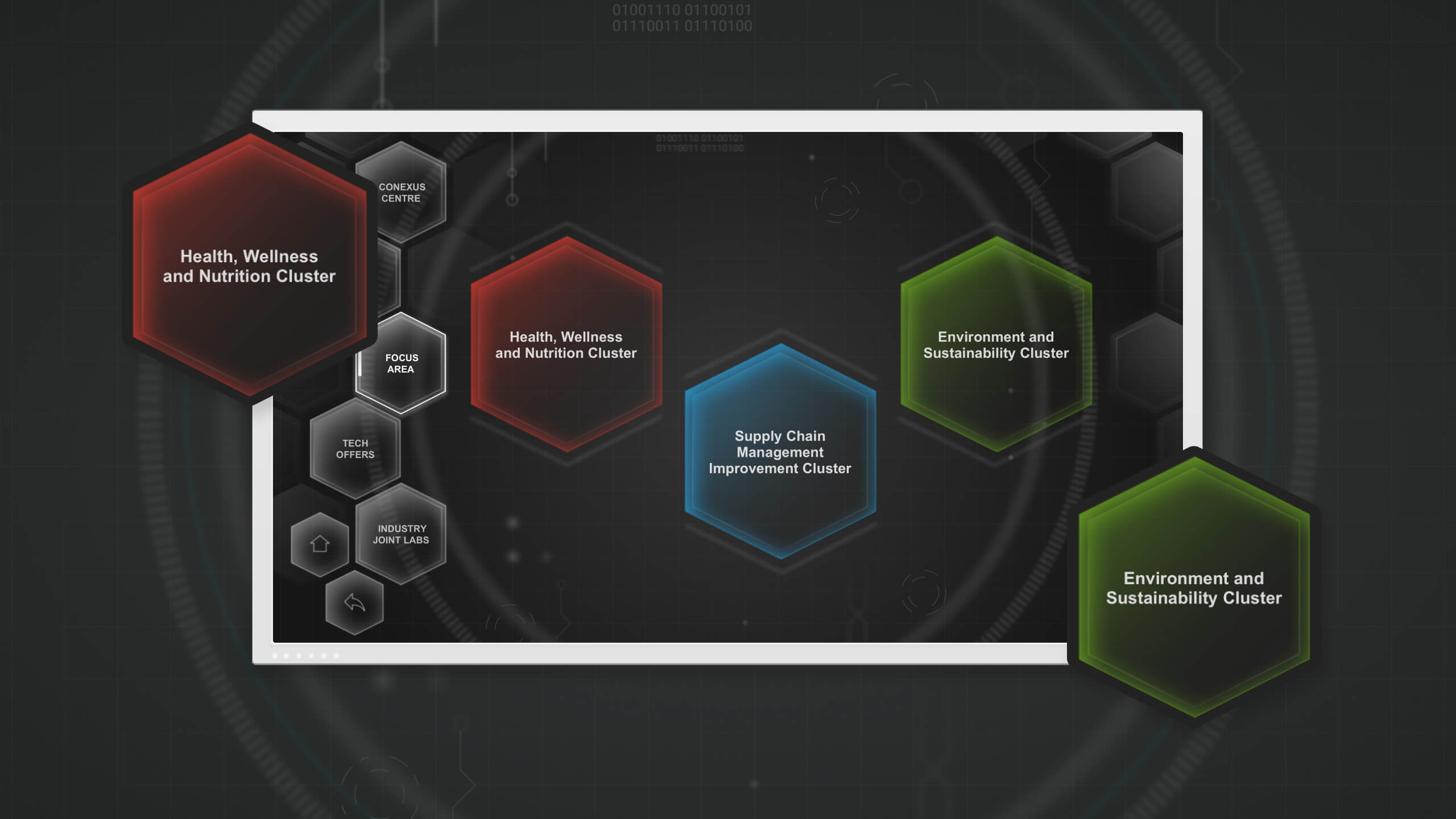
To highlight RP’s technological strength, the interface needed to feel futuristic and tech-centric, while also retaining RP’s branding. We experimented with various visual patterns, and found that a combination of binary code, grids and hexagons worked best. We introduced these visuals, merging them with RP’s branding and school colours to ensure harmony.
We also made navigation simple. RP designated distinct colours to their schools and centres, so for the intro page, we made use of them and displayed the list of schools and centres upfront. This meant users didn’t have to filter by school before getting to the centre they were interested in.
Working around limitations to better engage
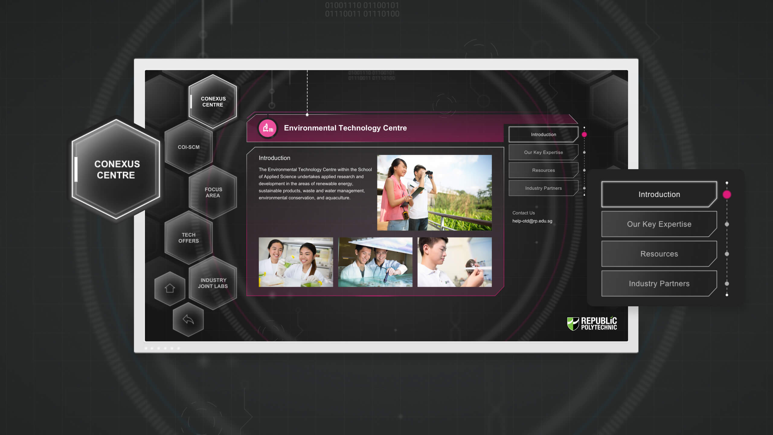
We had to ensure optimal viewing and interaction with the 4 wall-mounted screens. We were not privy to the screens’ mounting heights, and so placed the navigation bar on the left-hand side of the screen, which would mitigate any difficulties with usage stemming from users’ height differences.
There were also hardware constraints – the interface was made of static visuals with limited screen transitions. To add dynamism, we added motion with a trio of rotating rings around the “NeST” emblem on the homepage.
Users would not have time to read large amounts of text, so content was presented in short chunks at each stage of interaction.
Focusing on fundamentals to overcome challenges
For “The NeST” project, we had to adapt to both hardware and design challenges. By asking ourselves how we could create an optimal experience with existing resources, we managed to build an interface that effectively profiles RP’s strengths, bolstering their networking efforts.