


Dynasty Travel is a local travel agency that has been around for 40 years. We revamped their booking app with a fresh logo, clean interface and improved user experience.
Designed for browsing and booking
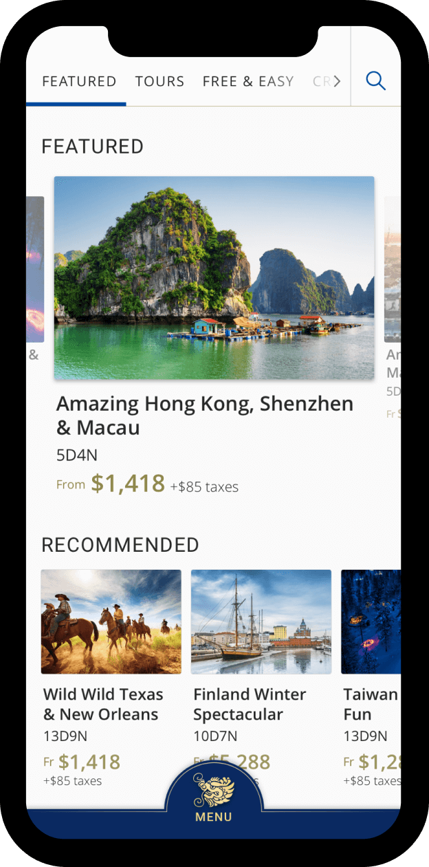
Based on our research, most users used travel apps to browse travel promotions and packages, instead of making bookings. Less than half used such apps for bookings.
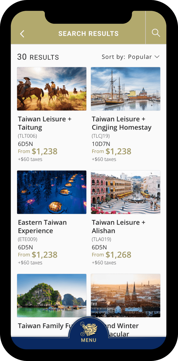
With the findings in mind, we made the app friendly for browsing users. To enable easy browsing, screens comprised mostly images, supported by text labels.
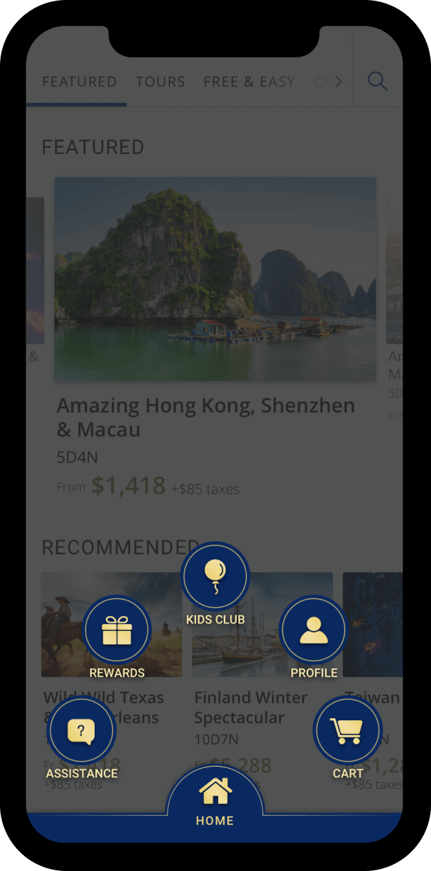
We also introduced a menu icon positioned centrally at the bottom of screens. Upon tapping, menu items in the form of icons would emerge sequentially.
With these menu items hidden unless drawn out, users could focus on viewing foreground content. They would not be distracted or compelled to access other menu items simply because they were visible. This better facilitated users to complete actions such as making bookings.
Enabling effortless navigation
With the many travel options and packages offered in iDynasty, the app comprised numerous pages. We needed to make the app easy for users to navigate.
At the homepage, we introduced a swipeable header bar at the top of the page. Users could access core categories through the bar, namely – Featured packages, tours, free and easy, cruises, hotels and flights. This enabled users to swiftly and conveniently access the relevant categories and desired information.
An enhanced experience through aesthetics
We also redesigned the app’s visuals for a more consistent feel. We used blue and gold for iDynasty’s redesigned logo. With blue as Dynasty’s Travel’s corporate identity colour, the inclusion of gold was intended to add a luxurious touch.
We applied these colours consistently in the app. For example, menu icons comprised gold illustrations in a blue background, labeled with gold text. “Search” and “Filter” buttons were coloured blue, while certain text elements were in gold.
Appealing to young ones
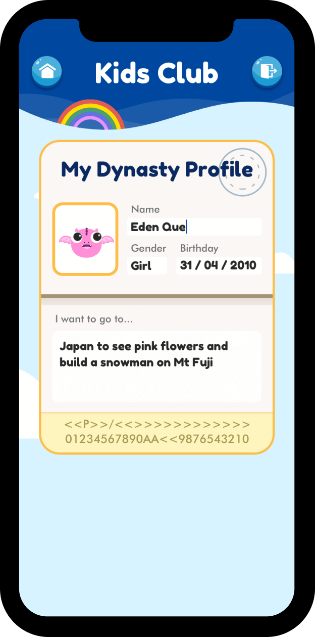
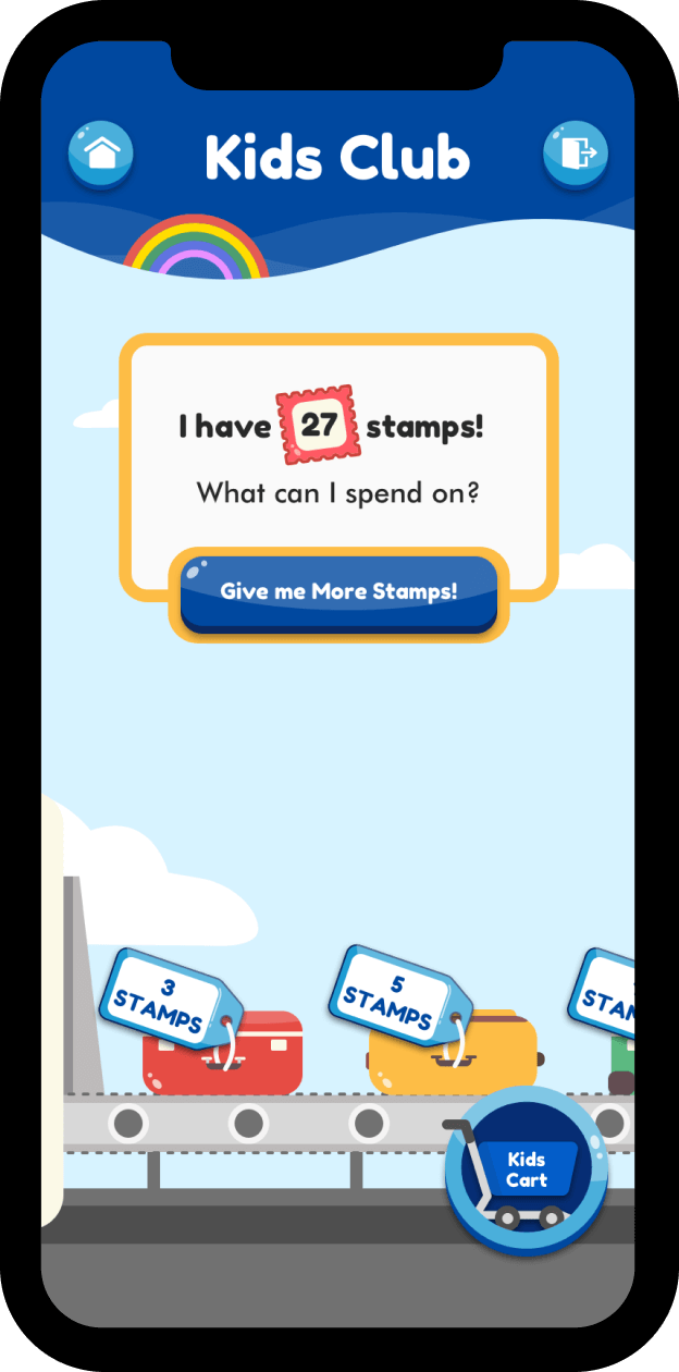
Kids Club was a fun add-on in the iDynasty app, which provided kids a fun way to redeem offers and gifts. We combined bold and rounded fonts with vibrant screen colours for greater appeal.
We also created male and female baby dragon icons as a childlike take on iDynasty’s logo, for kids to adopt as avatars on their profile page. In line with the overall travel theme, the Kids Club profile page was designed in the layout of a passport.
Travel exploration and booking, simplified
By redesigning Dynasty Travel’s app, we have made it more user-friendly and aesthetically pleasing for users. Now, iDynasty can serve as a convenient and useful tool for those exploring or booking their next holiday.