SoundEye started off as a social enterprise, providing monitoring technology solutions to aid caregivers of the elderly and healthcare workers. They have now expanded their products across Asia, in countries including Japan, Thailand and more. We have accomplished the following.
Information at a Glance
We presented SoundEye products via a gallery of images and a well-organised display of technical information. Users can quickly learn key details about the product’s design and specifications on one convenient layout.
The Social Entrepreneur’s Journey
We featured a detailed timeline to illustrate the origins and growth of SoundEye throughout the years. This gives visitors an easily-digestible view of SoundEye’s history.
An Enticing Contact Form
The contact form is designed to be attractive and simple so as to not overwhelm the user. We applied cool and calm colours to exude feelings of solidity and reliability.
Allowing Users to Conveniently Identify Their Needs
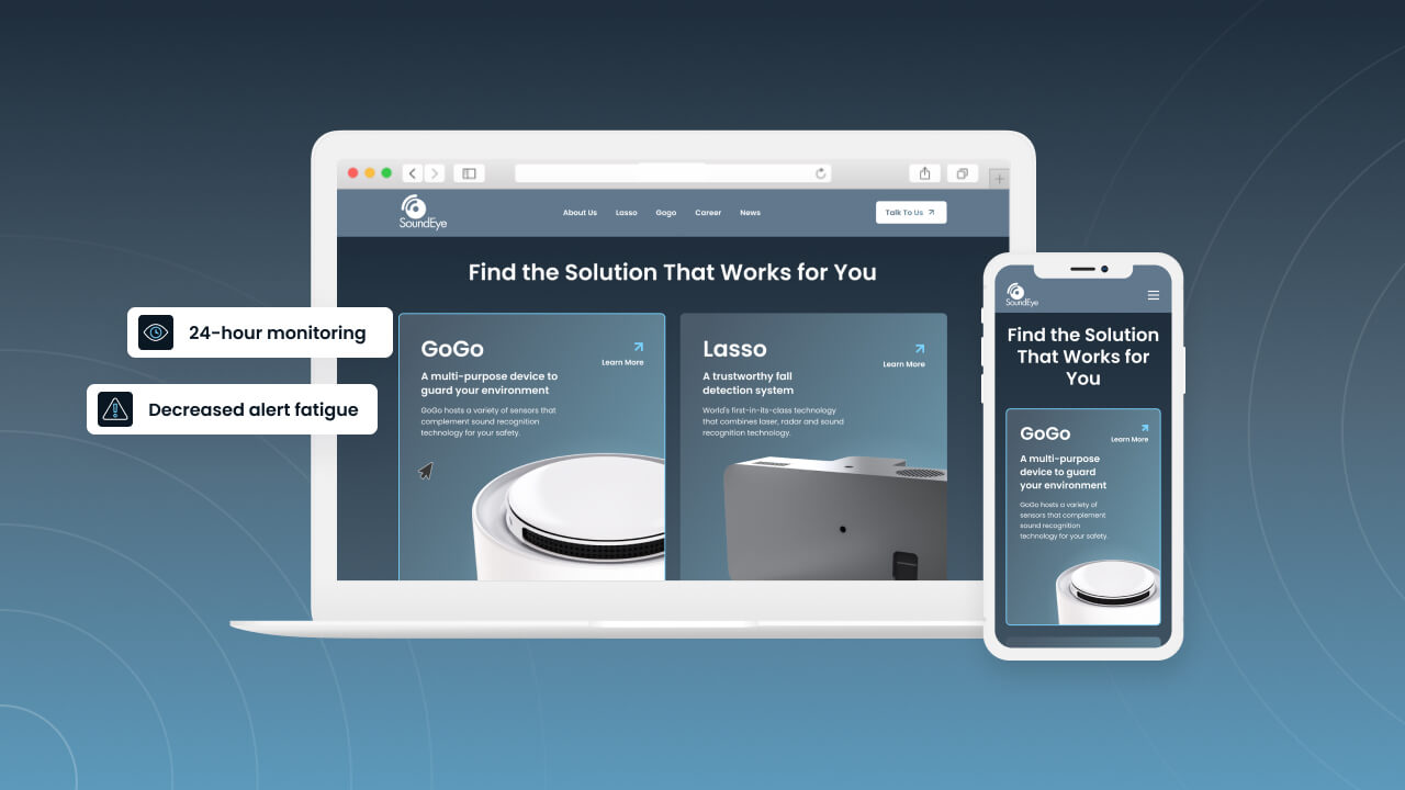
We placed SoundEye products in cards next to each other, allowing visitors to get a quick idea of which device best suits their requirements.
An urbane look and feel
The overall design and style were crafted to be classy and modest, with cool and relaxing complementary colours to sustain the theme across the site.


