Quickloan, located in the popular CBD area of Singapore, is an agency that offers accessible financial advice for individuals and businesses. Just three simple steps are needed to obtain loans or a consultation. We were assigned to revamp the Quickloan website to make the user journey as convenient as possible.
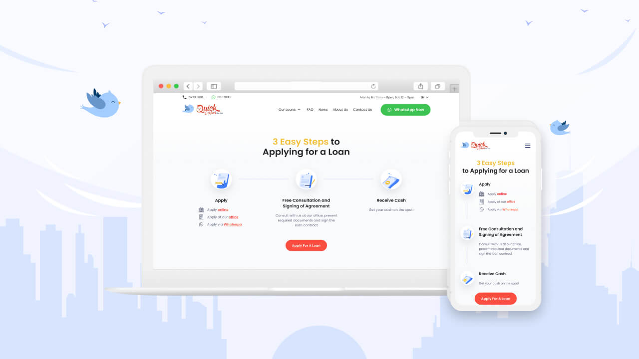
A Simplified Process
Poorly organised information on a web page can overwhelm and confuse visitors. Despite some initial challenges, we were able to leverage our expertise to create a loan process that is limited to three convenient steps. Visitors can easily identify their needs and seek out the service they require.
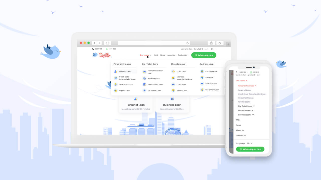
Convenient Navigation for Users
We consolidated the menu bar to include a listing of all available loan services under the ‘Our Loans’ tab. This gives visitors an overview of what Quickloan offers and lets them navigate to their desired loan service page efficiently.
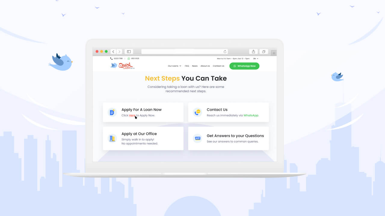
Access to Information to Keep Customers Up-to-Date
Realising the importance of information, we designed a clean and structured knowledge hub where visitors can easily find what they want to know about Quickloan and its services. We also incorporated avenues for conversion within the content pages.
Dedicated Landing Pages for Effective Communication
We crafted multiple landing pages for specific Quickloan services. This helps visitors easily find what they need and increase conversion opportunities for the agency.
Addressing Questions from the Public
Modern consumers are likely to do considerable research before committing to a product or service. We set up a comprehensive FAQ section to cover commonly asked questions and potential concerns that clients may have.


