We are glad to have had many great opportunities to work with multiple clients – mainly in the industries ranging from police force, logistics to schools – on designing the UX & UI of their kiosks.
But as we’ve gotten pretty used to designing on mobile apps and websites, we sometimes face challenges when working on kiosk projects. When that happens, we go through many thoughts, testing and iterations, and managed to resolve most of them while learning something new.
With this, we would like to share some guides for when you work on your next kiosk project.
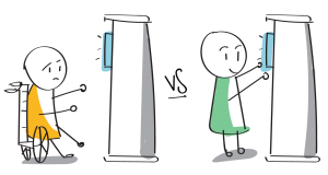
1. Cater the design for people at a sitting position
Not everyone interacting with the kiosk is at a standing position. Take into consideration that there may be people in a sitting position using it. Make sure they are considered for and catered to. Examples can be catering it to be wheelchair-accessible.

2. Work with an actual kiosk prototype
Today’s kiosk screen size ranges from 40 inches onwards. The ratio of the screens that we are used to designing and the actual kiosk screen size may vary and affect the interaction.
Without an actual prototype, we make assumptions that the users are able reach all the areas on the screen, and in turn affect the usability of the design. It is key that we design from an actual prototype than design from different assumptions.
3. Test with the users
With an actual kiosk prototype, test with definite users to gather feedback and observations from these users. For example, when designing the kiosk for schools, we faced difficulties where our users’ height varies. We did not consider that into our UI and thus, some students were not able to access certain functions.
4. Take note on the technology limitations
The backend of kiosk technology varies. On one particular project we worked on, having pop-outs were not allowed due to the software limitation, so each page had to be linked as an individual page, similar to the web in the early 2000s. We had to work around this and design like how we would design for the web or mobile app.
Another key issue to note is the hardware limitation. The reflection on the kiosk screen may differ a lot from the smartphones or tablets today. We had to design a loading screen that reduces the actual transition time so that users would not be frustrated to the long wait time.
5. The interaction between user and kiosk
When a user interacts with the kiosk, the user will most likely use the whole hand. So, we need to think from the perspective of the users – how they may place their hands and at which position will the interaction be most comfortable at.
To design the most comfortable position, testing with multiple users using the actual prototype is required to better observe and understand where to place certain content and navigational elements.
Kiosk is going to be ubiquitous
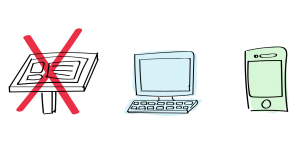
Even with the latest smartphones in our hand, kiosk still play an important role in our life, allowing us to access information without downloading another app. Kiosks are continuously present in our life be it in shopping malls, restaurants, ticketing, or even self-checkout services, etc. The relevance of kiosk is something that cannot be replaced, especially with the advancing technology. Human labours may be greatly reduced and self-ordering kiosk or automated service machines are widely employed, altering consumer behaviour.
Like the article? Share it!


