Emotions are an essential part of life—they help us communicate our needs and desires, make decisions, respond to opportunities and navigate diverse social interactions.
But how are emotions relevant to web design? Do feelings really matter when you use a website?
In this article, we’ll explore the role of emotions in designing websites and how to ensure that your site effectively evokes the right emotional responses in your users.
Why Are Emotions Important in Web Design?
Emotions significantly impact user experience (UX), engagement and behaviour. When you interact with a website, you are not just processing information—you’re also experiencing emotions that can influence your decision-making process and overall satisfaction with the site.
If users feel a positive emotional response to a website, they are more likely to spend time on the site, share it with others, and return to it in the future.
Conversely, negative emotions, such as frustration or confusion, can lead to high bounce rates and a loss of users.
Emotion in web design can even influence conversion rates—a website that appeals to users’ emotions and needs can increase the likelihood that they will take desired actions, such as making a purchase or signing up for a newsletter.
Emotion in Web Design and User Experience
It’s essential to consider the emotional impact of UX design decisions when creating your website. This is especially true for websites intended to elicit a specific emotion, such as e-commerce sites that aim to persuade users to make a purchase.
Different websites seek to evoke different emotions depending on their purpose or context—these feelings can include joy, surprise, anticipation, trust, sadness and even anger or disgust.
A well-designed website that evokes the intended emotions can result in higher conversion rates, increased customer loyalty and improved overall user satisfaction.

Tips for Designing Websites That Evoke Positive Emotional Responses
Designers can use various elements such as colour, typography, and layout to create the desired emotional response in users. Here are some techniques to effectively incorporate emotion in web design for your site.
| Design Element | Impact on User Emotions |
| Colour Psychology | Affects emotional state and behaviours through the use of colours. Can be used to stimulate specific emotions, such as excitement or trust. |
| Visual Design | Creates a visual hierarchy that guides attention and emotional responses. Can set a mood, convey brand personality, and communicate important information. |
| Typography | Choice of fonts, sizes and styles can impact user emotions. Serif fonts evoke tradition or elegance, while Sans-Serif fonts are more modern or informal. Can be used to emphasise important content, create contrast and add personality. |
| Storytelling | Helps users emotionally connect with content by creating a narrative or storyline around a brand or product. Elements can elicit sympathy, spark motivation, or create a sense of community. |
| Microinteractions | Small, subtle design elements that provide feedback or interaction to the user, such as button hover effects, loading animations or notification alerts. Can create a sense of delight or satisfaction for the user, contributing to a positive emotional experience. |
| Personalisation | Tailoring content or design elements to individual users can create a sense of personal connection and increase engagement. Can include customised recommendations, personalised messaging or targeted content based on user behaviour or preferences. |
| Social Proof | Use of social influence or social validation to encourage user behaviour or increase trust. Can include user reviews, social media endorsements, official certifications or trust badges that signal credibility or authority. |
| Usability and Accessibility | A website that is easy to use and accessible to all users can contribute to a positive emotional experience. Designing for usability and accessibility can create a sense of ease, efficiency and inclusivity, which can help build trust and satisfaction among users. |

Emotion in Web Design: Case Studies
In this section, we will explore a few concrete examples of emotion in web design utilised by successful international businesses.
Case Study #1 Mailchimp
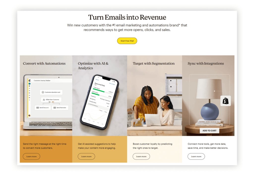
Mailchimp is a marketing platform that focuses on making email marketing easy and accessible for businesses of all sizes. The company’s website is an excellent example of a website that evokes positive emotional responses from its users.

- Bright and Engaging Design – The Mailchimp website uses playful and friendly design elements, including colourful illustrations and animated characters. These create a welcoming and approachable feel. The use of language is also effective, with the use of friendly and conversational copy.
- Simple Navigation and Guidance – Mailchimp’s website is easy to navigate, with a clear and direct layout that guides users through the website’s different sections. The site also includes helpful resources, including guides and tutorials, to help users learn more about email marketing and how to use the platform.
- Takeaway – Mailchimp successfully creates a sense of trust and familiarity that encourages users to engage with the platform. Their website creates an emotional connection with its users, setting it apart from its competitors.
Case Study #2 Smartlead
Smartlead is a cutting-edge email marketing platform that leverages artificial intelligence (AI) to streamline and optimize email campaigns. From providing unlimited AI warmups to ensuring your emails always land in your prospect’s inbox, Smartlead offers a suite of features designed to supercharge your email marketing efforts. What sets Smartlead apart from other platforms is its Master Inbox 3.0 feature, which allows you to connect all your mailboxes and seamlessly manage all your email communication from one single dashboard.
- Clear and Intuitive Design – Smartlead’s web design is clean and intuitive, making it easy for users to navigate and find the information they need. It uses a simple color scheme and layout to create a calm and focused atmosphere. This clear and straightforward design removes any potential stress or confusion, evoking feelings of ease and comfort. Users can quickly understand what Smartlead offers and how it can benefit them, leading to an increased likelihood of conversion.
- Interactive Demonstrations – Smartlead’s website includes interactive demonstrations of its key features, such as the Master Inbox 3.0. These demonstrations allow users to see the platform in action, creating a sense of anticipation and excitement. By offering a sneak peek into the platform’s capabilities, Smartlead effectively engages its users and stirs their curiosity. This element of surprise and discovery can significantly boost user engagement and retention.
- Powerful Testimonials – The use of testimonials on the Smartlead website serves to build trust and credibility. These testimonials are strategically placed throughout the site, sharing success stories from satisfied customers. By including real-life experiences, Smartlead evokes feelings of trust and reliability. This emotional connection can greatly influence a user’s decision to choose Smartlead, thereby increasing conversion rates.
Case Study #3 Calm
Calm is a popular meditation app that provides guided meditation sessions and mindfulness exercises. The app and website are designed to evoke a sense of calm and relaxation in users.

- Mellow Colours and Straightforward Layout – The website’s colour scheme is dominated by soothing blues and greens, while the layout is clean and uncluttered.
- Relevant Imagery and Effective Copy – Additionally, Calm’s website uses the imagery of nature and peaceful environments, such as beaches and forests, to create a feeling of tranquillity and peace. The use of language is also vital to the site’s impact, with copy that emphasises the benefits of meditation and mindfulness for mental health.
- Takeaway – By cultivating a sense of serenity and relaxation in its users, Calm has built a loyal user base and established itself as a leading brand in the mindfulness space.
Case Study #4 Warby Parker
Warby Parker is a popular online eyewear retailer that offers stylish and affordable glasses and sunglasses. The company’s website is designed to evoke a sense of fun and playfulness in its users.

- Delightful Visuals and Clever Copy – The website’s design features colourful graphics and vibrant photos, while the language is witty and irreverent.
- Engaging Interactive Features – Warby Parker’s website also includes a virtual try-on feature that allows users to see how glasses will look on their faces before making a purchase. This feature adds an element of interactivity and fun to the shopping experience, helping to create a positive emotional connection with the brand.
- Takeaway – With the effective use of emotion in web design, Warby Parker has been able to differentiate itself from traditional eyewear retailers and build a loyal customer base.
Design Websites That Evoke Positive Emotional Responses With JIN
Understanding your target audience’s emotional needs and preferences will help you create websites that offer superior UX, leading to better user engagement and conversion.
Talk to our team at JIN Design to discover how you can utilise elements of emotion in web design to connect with users on a deeper level and establish trust and loyalty.
We can help you craft an impactful website from scratch or optimise your existing site to ensure it better meets your goals.


