An Insurance Game
Ever experienced a situation wherein you are taking a leisurely stroll along the marketplace on a lazy Sunday afternoon, only to have your swagger interrupted by an insurance sales agent?
No? C’mon now, I can’t possibly be the only one!
We’ve all encountered a persistent little man who insists on explaining selling you a new policy/insurance plan. He throws in an enthusiastic “Let’s chat over a cup of coffee!” as an incentive to get you to participate, and for the next hour you inwardly yawn through the myriad of information being tossed at you – all despite the coffee…
Well, fret no more. A joint venture between AIA The Real Life Company and JIN Design has revolutionized the insurance sector forever, you’ll see!
Project brief
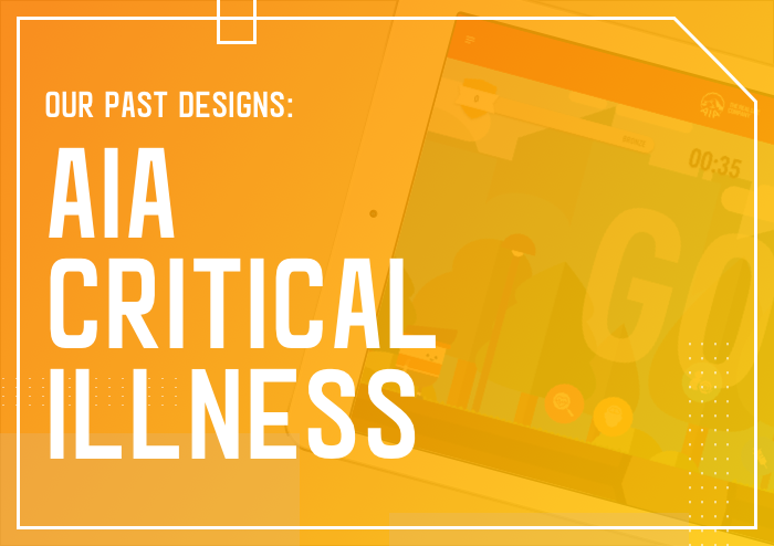
In 2016, the esteemed insurance company and JIN Design teamed up to design the AIA Critical Illness app for iPad. #honoured #canyoufeelthepressure
Aimed at promoting the new critical illness insurance plan, the app essentially comprises of 3 components. Of these, an interactive game called the Go Go Go challenge serves to employ a more exciting approach to engage, introduce and explain how the insurance plan works.
Now, it is a known fact that illness can rear its ugly head anytime. But just as there is no age limit to having fun, one is never too young to invest in insurance!
That’s why, the primary target audience for this project were AIA customers between the ages of 21 and 50, as well as senior citizens below the age of 70.
After snooping around and conducting our research, we came to a key understanding; the app must be designed in a way that would enable our target audience to operate it independently, with little to no assistance from AIA agents.
Hurray, AIA customers! No more listening to AIA agents drone on and on! 😛
Key design challenges
1. Game animation and characters
AIA wanted a game that was interactive yet easily understood by the masses. Thus, we made use of
- A vibrant background
- Cheerful music
- Nuggets of information that could be easily processed and retained by customers
Regarding game characters, AIA wished for characters to have a minimal look to them. So, we opted for simple illustrations such as a flat layout. Additionally, we designed the avatars to depict Asians and dressed them in athletic, sports attire to strike a greater relevance with customers, largely locals. Genius much? 😛
2. In-app calculations
Another component of the app, the Critical Illness Illustrator calculates supposed Annual Premium. Incorporating these mathematical calculations into the app was a key concern.
We tackled this issue by condensing the complex process of calculating Annual Premium plans. Instead, customers are required to key in just 3 inputs such as age, gender and sum insured.
Pro tip: In design, less is always more!
3. Key features
Power reset
The main selling point of the critical illness plan, this feature enables AIA’s clients to reset their claim up to 3 times 100% of the amount they insured. We emphasized this feature by designing a distinct battery icon and integrating it in our game. #easypeasy
Virtual pitfalls
This feature ties in with the power reset feature as falling inside a virtual pitfall indicates game over (aka the onset of a critical illness).
Thereafter, an accompanying pop-up message prompts the user to “power reset”, and this in turn allows users to resume the game (aka understand and subtly appreciate the benefits of critical illness coverage). #masterstroke 😀
And that my friends, is how I met your mother we designed the AIA Critical Illness app!


