Micro-interactions: What Are They?
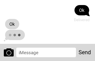
You’re using a chat app to talk to a friend. Anytime they take a while to type a message, a familiar indicator appears, along – usually – with a prompt that says, “So and so is typing…”
Those anxiety-inducing grey ellipses are a micro-interaction – defined by author Dan Saffer as: “Contained product moments that revolve around a single use case—they have one main task.”
Basically, they perform one thing, and one thing only. Their main purpose can be summed up in the following:
- Communicating feedback, or results of an action
- Give a sense of direct manipulation
- Visualising results of an action and preventing errors.
Why do they matter?
Micro-interactions are everywhere, from our devices, to our appliances, to our environment. True to their name, we seldom notice their presence – yet their absence can cause a big upset. Despite being near-invisible and tiny, micro-interactions are incredibly important to day to day life. They’re what separates a great product from a “meh” one.
Little things like an electric kettle automatically shutting off when the water’s boiled, or your fridge beeping incessantly because you didn’t shut it properly. Imagine if those little details weren’t a thing. The kettle would boil itself dry, and the contents of your fridge would spoil.
For digital spaces, micro-interactions would be things like a button changing colours when you hover on it. Or a red “X” indicating where you’ve made a mistake on filling out an online form. Likewise, small things – but the impact they have is huge. If the button didn’t change colour, you wouldn’t know that it was clickable. If there was no “X”, you’d spend an annoying amount of time figuring out where you messed up.
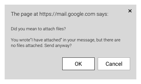
A well-designed micro-interaction improves the user experience in invisible ways. If it becomes too obvious, then we couldn’t call it “micro” anymore. Take Gmail, for example. You’re sending someone an attachment. You inform them to “Please see attached”, and hit the “send” button. Gmail helpfully prompts you and lets you know that you haven’t attached a file.
Many people appreciate this gesture
How do we design micro-interactions?
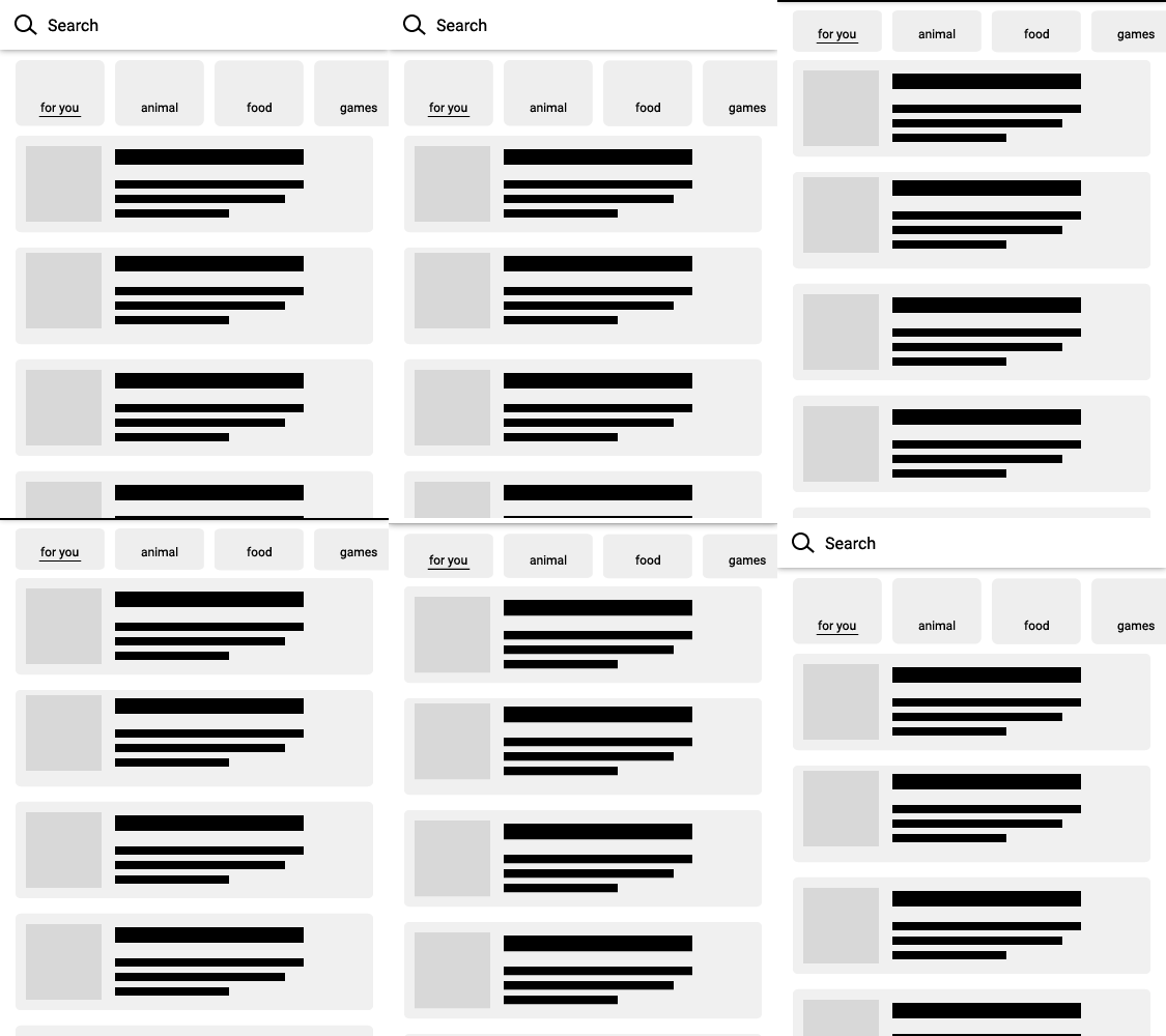
Here is a micro-interaction we designed. When a user scrolled down, the top menu would automatically compress. The menu would then take up less space. This let users enjoy the content while maintaining accessibility. It’s a small, subtle thing, easily missed by most. But if we didn’t include it, the experience would definitely not feel as smooth.
When we design micro-interactions, we follow some basic rules:
- Keep it simple – avoid over design
- Factor in long-term use. Something that is fun at first may turn into a complete chore after the tenth time.
- Make sure it integrates seamlessly with the flow of everything else.
- Design based on the target audience. The end design is determined based on who will be using them.
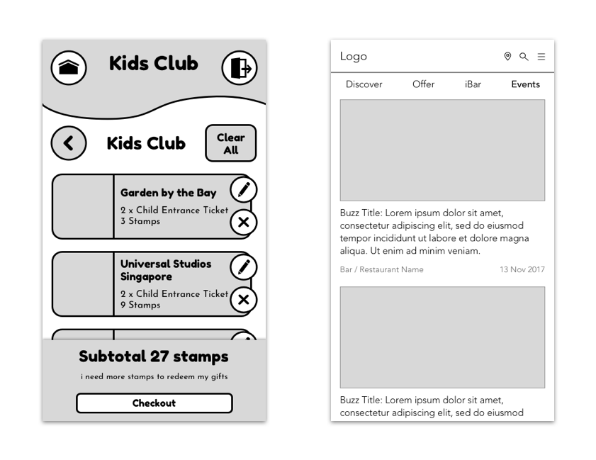
An example of the last point would be two projects that we worked on. One was aimed at children, and another was for adults. Both had micro-interactions, but we approached them differently.
The app for children had micro-interactions that were more prominent. This was so we could capture their attention. It also made it easier for them to follow the results of their actions. Bolder animations made it easier for them to interact with the app.
The other app was aimed at adults, and was meant to be a sophisticated, elegant app. It was for fine dining, thus we opted for sleek, subtle animations. We kept our users immersed in the experience and maintained consistency across the app’s concept and design.
What about bad micro-interactions?
An example we experienced was a bluetooth speaker that we were going to test. We powered on the speaker, and its blue indicator light was on. But, in addition, it also played a very loud audio clip saying “This speaker is now on and ready!” that could not be disabled.
All the audio clip served to do was to startle the user. It broke the flow by presenting us with something that was unnecessary.
Bad micro-interactions break user flows and disrupt the narrative. It burdens the user with more cognitive load than is necessary. It always pays to bear in mind that you don’t want to overdo it – keep it simple and clean.
A strong base design is the foundation for a good micro-interaction, and that’s what we stick by. We build a strong foundation first, and only then do we start building in the micro-interactions.

