What is Microcopy?
Microcopy, as the name suggests, is a small chunk of text that helps users perform an action. Whether digital or on print, it can enhance the overall design and user experience.
Action buttons like “Yes/No”, “Previous/Next”, or error messages such as “Incorrect password, try again” are considered microcopy. It’s crucial that these are written clearly so users comprehend them easily.
Small Words, Big Influence
Microcopy can differ depending on the action you want users to take. A/B testing can demonstrate that simple changes to a button’s text sometimes leads to significant improvements in user click-rates.
Tone Matters
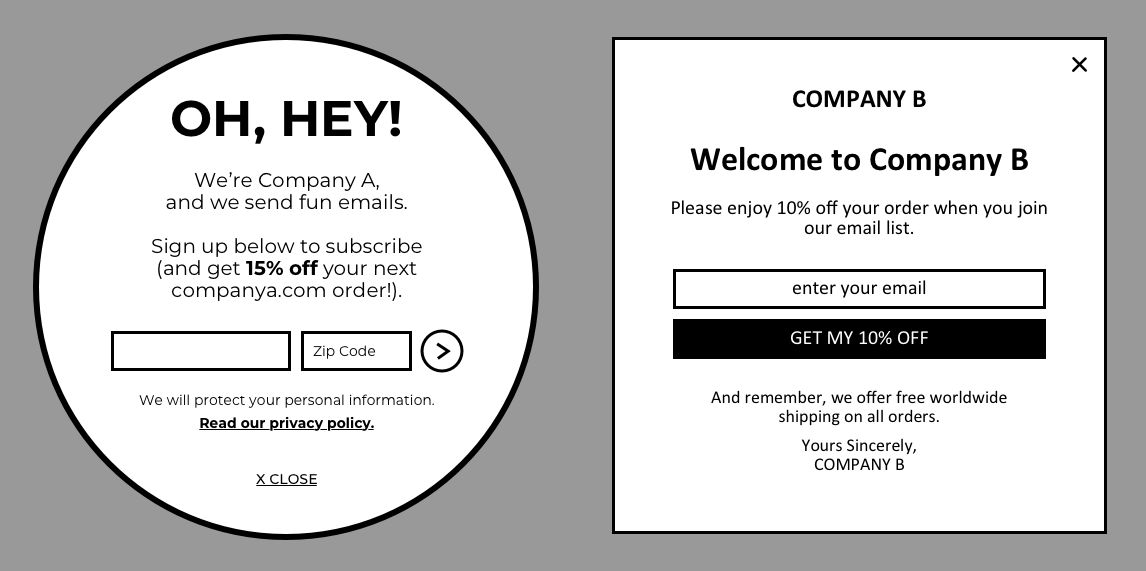
Good microcopy conveys a certain feeling, reflecting the tone and context of its medium. A formal, polite tone feels professional and businesslike. A casual, informal tone feels friendlier and more personal. It’s all about appealing to the target audience.
Both of these are asking you to subscribe, but in different ways.
One Size Doesn’t Fit All
Before, we rarely thought about how microcopy affects user experiences. We focused merely on design concepts, wireframes and visual mockups. We seldom paused to consider if label text fit the theme, or the message the page sent. After going through many projects, we started noticing how our microcopy were all similar, regardless of the brand or concept.
We started paying attention to what we were writing. We began setting tone guides for projects and apps, making sure the microcopy was consistent and meaningful.
One such project was a donation app we designed. It had “Donate Now” as a button label, which sounded commanding and cold. These weren’t the emotions we wanted to evoke in people we were seeking donations from.
By changing the button text from “Donate Now” to “Lend A Hand”, we gave a more human and friendly touch. Instead of telling them what to do, we appealed to the compassionate side of users. This encouraged them to take action of their own volition.
Another project we worked on had children as the target audience. Writing for kids is not the same as writing for adults. We went down to preschools to observe how teachers spoke with the children. Some of the copy would be voiced, so we kept the script simple to make it easier to understand.
Let’s take a look at the reward completion screen designed for this project. Plain text like “Confirm” and “Cancel” seemed dry and flat against the liveliness of the app. For a better fit, we used “Keep Going” and “Get Reward” instead.
The project was meant to be fun and kid-friendly, so shouldn’t the microcopy reflect that?
Writing Better Microcopy
Here’s some advice from us as a UX design agency on creating good microcopy:
- Cut to the chase so you don’t confuse users
- Use figures to encourage users to take action and to build trust. For example, “99% satisfaction guaranteed!”
- Don’t use negative language – you don’t want people developing a bad impression of your content! E.g.
Good copy shouldn’t make a user feel bad.
Microcopy is Design
Microcopy shouldn’t be an afterthought of design. It makes or breaks the user experience, and has the power to influence how users feel and act. What’s more, we don’t want a fun website to have dull, formal copy. Microcopy should be consistent with the concept, theme and overall branding.
Microcopy may be small, but it plays a big part in the UX design process.


