How Icons impact UX design
Icons are ubiquitous. They are everywhere in our lives. As we’re sat here, typing this out, there are at least twenty visible icons on our monitors. Before we talk about icons in the context of user experience, what exactly are they?
Types of Icons
An icon can be generally defined as an image of symbolic value whose chief purpose is to communicate something. In digital design, icons are used to support usability and provide good user flow.
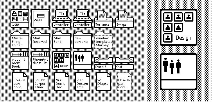
The Xerox Alto (1981) was an early example of icons on a digital interface for consumers.
In digital spaces, icons fall into three categories:
- Resemblance icons – these depict the physical object they represent. (Eg, a letter icon for e-mail)
- Reference or Symbolic icons – these depict a concept that the icon is meant to represent. (Eg, a vice/clamp for a file compression software)
- Arbitrary icons – Shapes that only have a meaning by definition. (Mac’s Command key is an example of an arbitrary icon.)
How far can icons take us?
If an icon can express entire ideas or concepts in one small, neat package, it might seem like they’re a panacea to every designer’s woes. We could make a whole UI with nothing but icons and in theory, it should function great.
We showed these icons to people around the office, and we got a variety of responses. Some such as the camcorder, thumbs up and trash bin (record video, “Like”, and delete respectively), were more or less unanimously understood.
But others, such as the gift box, diamond and star, often meant different things depending on who we asked. This goes to show that icons by themselves are not quite the magical cure-all we assumed they’d be.
What about just good old text?
The reason icons are so versatile is also the same reason why an icon-only UI is likely to trip and fall flat on its face. They save space by reducing text, but how do you know what exactly an icon means if each is capable of representing dozens of things?
This doesn’t mean we should go to the other extreme and abolish icons – consider the images below: Two UI’s, one purely icons, one purely text.
We couldn’t tell you with full confidence what the icons in the first toolbar did. However, we can argue that text is completely clear, how can it go wrong? There’s no confusion about what function does what; it’s all labelled. Except that now, the second toolbar looks rather sterile and dull. It’s functional, but it’s also very boring.
Using icons responsibly
Icons give personality to a website or app. They add visual interest and allow you to maximise available space while maintaining functionality when text labels don’t fit.
That said, when it comes to designing and deploying icons, what do we do? Here are some of the key things we take into account before we design.
Context first
We must always consider the context that they’re going to be used in first. For example, an icon of a pencil can either mean “edit”, or “compose message”, depending on the app.
Who’s using your product?
Who uses your app is just as important as what people use it for. Perhaps your product is aimed at children, who might not be able to read yet. Or perhaps an older audience that may not be able to understand an abstract icon, or have trouble remembering what it represents.
Don’t reinvent the wheel
Some icons enjoy almost universal recognition. There’s no need to mess with what works. The house for “home”, a magnifying glass for “search”, a shopping cart for a, well, online shopping cart.
Do we really need icons here or will text suffice?
Sometimes, we don’t need an icon. If a function or concept is difficult to convey in an icon, we can consider just using text labels. However, space is also a factor – if you’re bound by space constraints, then consider which functions can be replaced by icons.
After all of that’s done, the next step for us to test these icons – for recognisability and memorability. If a first-time user can’t figure out what an icon does, or remember what it does, then that icon has failed its one job.
Icons aren’t a one-size-fits-all solution – but we can’t dismiss their importance in the world of UX design. Used correctly, they enhance user experiences. They can also give your website/product personality and flair, making it stand out amongst a sea of competition. They can communicate a complex idea in one image, serving as guides for users. Or they serve to prettify your website and add joy to users’ lives.


