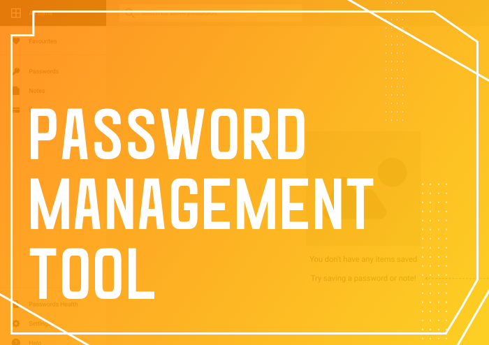

Observation 1: Dashboard layout is the standard layout

There is a reason why the dashboard layout is the standard layout between multiple tools. They are designed to display information to be short and sweet, and require very little cognitive thinking to process. Users can therefore extract the information they need and complete their task within seconds.
Dashboard layouts are designed to display information quickly, thereby providing users with the ability to make clear decisions and complete their tasks efficiently.
Observation 2: Viewing your passwords in list-view vs grid-view

Considering that both these views are designed for entirely different purposes, they each have their respective pros and cons.
List-view allows space for more text-based elements such as name, description and type of password. The detailed structure thus enables users to decide their course of action easily.
Grid-view, on the other hand, is designed for quick scanning. Users can swiftly scan up to 4 or even 6 grids at a time. This feature is especially useful for grouped information.
Observation 3: Managing user groups and permissions
An overview of grouped passwords is a standard feature for most tools. It enables users to manage their passwords better. Furthermore, restricting who can gain access to these passwords is imperative to prevent passwords from being abused. These kind of customisable features “gives” the user control over the software and develop a sense of ownership. In essence, this will help boost user retention rates.
Besides these observations, we also noticed a few usability flaws that some of these tools failed to address.
Pain Point 1: Zero on-boarding experience
 For these password management tools, there was no proper on-boarding for users to familiarize themselves with the platform. This made the platform less user-friendly as users had to learn and navigate through the interface themselves. Sometimes, this issue can be even more frustrating if the UI has a steep learning curve.
Pain Point 2: Tools don’t log out after being inactive
As a tool that emphasises on credential security, the inactivity of use function is crucial for users. This is to prevent password exploitation even if it can be copied without seeing the actual characters. Having said that, a good design can greatly improve usability and builds a sense of trust between the user and the digital tool.
Pain Point 3: Streamline content that is only available for the user
Do you prefer to have your dashboard cluttered with every password information or only have the ones that are relevant to you? Would you like to spend time looking for a password amidst a hundred others or prefer having the relevant password information within seconds? It is best to present only what is required by the user.
While writing this article, one of the tools we analyzed recently had an update that improved its usability and features. This serves as a constant reminder for us to review our interface regularly as there is always room for improvement!
Our Design Solution

Through the above-mentioned observation and analysis, we came together and designed a few prototype screens. Let’s see how we improved certain usability features.
Addressing the problems and maintaining the industry standard
For starters, we implemented an on-boarding experience for new users to help remove the steep learning curve. Users would also save time and not be lost upon arriving at this interface as they would be given step-by-step guidance on how to operate the screen.

The next pain point we tackled was the inactivity issue. There were two solutions in particular that stood out. The first solution was to have a pop-up feature to notify the user that they are inactive and whether they would like to remain logged in and continue the session. The second solution was to have it automatically logged out and enable the user to re-enter his/her master password to continue the session.
From a user perspective, it is better to forewarn the user that they are inactive and will subsequently be logged out of their account. This way, the user would have time to react and respond to the message prompt accordingly.

Lastly, streamlining the content for the user is simple. We will segregate the different group of functions with dividers. This enables the user to visually digest the information being presented on the screen easily.

Empathy when designing
To sum up this article, designers are not just makers; designers are also thinkers. That is to say, when we as designers create something, we should always put ourselves in the user’s shoes. We should think about the entire user experience and what the user can expect through our design. If we design with that consideration in mind, every design will surely go a long way!